UX Anatomy
UX Anatomy: The Button
A field-notes style UX anatomy page about buttons: what they do, how they fail, and why this tiny rectangle carries disproportionate responsibility.
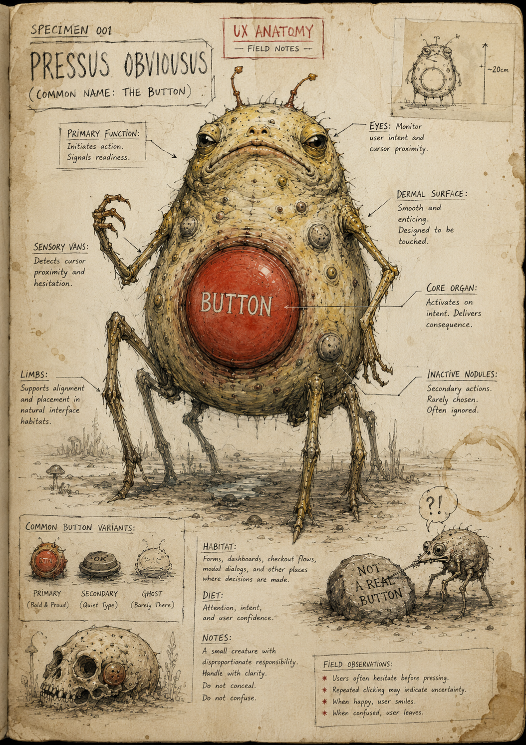
Specimen 001: The Button
Creature name: Pressus Obviousus
Common name: The Button
Habitat: Forms, product pages, checkouts, dashboards, account flows, app interfaces, and anywhere a human is expected to do the thing.
Field Description
The Button is one of the most commonly observed creatures in the interface ecosystem.
At first glance, it appears simple: a small, contained surface with a label. But do not be fooled. This modest beast carries disproportionate responsibility. It is often the final point between intention and action, desire and consequence, commitment and retreat.
A button asks the user to cross a threshold.
That threshold might be tiny:
Save
Continue
Search
Add to basket
Or it might be enormous:
Submit application
Pay now
Delete account
Book appointment
Send message
A button is not decoration.
A button is a decision point wearing a rectangle.
Anatomical Function
The button’s job is to make an available action clear.
A good button answers three questions quickly:
- What can I do?
- What will happen when I do it?
- Is this the action I’m supposed to take now?
When healthy, the Button creates confidence.
When diseased, it creates hesitation, misclicks, abandonment, rage, or the chilling suspicion that the website was assembled in a cupboard by raccoons.
Healthy Button Traits
A healthy Button usually has:
- A clear action label
- Enough visual contrast
- A recognisable clickable shape
- Sensible placement near the thing it controls
- States for hover, focus, active, disabled, and loading
- Enough spacing around it to avoid accidental taps
- A label that describes the outcome, not just the mechanism
For example:
Better:
“Create account”
Weaker:
“Submit”
Even worse:
“Click here”
Absolutely haunted:
A grey rectangle that says “Proceed” and opens a PDF, deletes your draft, or triggers a newsletter pop-up from hell.
Common Mutations
1. The Mystery Meat Button
This button uses vague labels like:
- Submit
- Continue
- Proceed
- Confirm
- Next
These labels are not always wrong, but they become dangerous when the user cannot predict what happens next.
The Mystery Meat Button feeds on uncertainty.
2. The Invisible Button
This button technically exists, but visually resembles plain text, a decorative block, or a sad disabled tile.
Users may not click it because they cannot tell it is alive.
3. The False Button
This is something that looks clickable but is not.
Cards, headings, icons, images, table rows, and filter labels are common hosts. Users poke them. Nothing happens. The interface stares back silently like a haunted Victorian child.
4. The Disabled Goblin
This button is greyed out with no explanation.
It says:
“No.”
But not:
“Why no?”
“What do I need to fix?”
“Will I ever be allowed joy?”
Disabled buttons can be useful, but only when the interface also explains what is missing.
5. The Button Swarm
Too many buttons appear at once, all shouting for attention.
Primary button. Secondary button. Tertiary button. Ghost button. Icon button. Text button. Button pretending to be a link. Link pretending to be a button.
The user is no longer making a decision.
They are surviving a tiny administrative stampede.
Behavioural Symptoms
A sick Button may cause:
- Repeated clicking
- Dead clicks
- Rage clicks
- Form abandonment
- Accidental submissions
- Low confidence before payment
- Users scrolling around looking for “the real button”
- Users using browser back because the interface has failed to provide a sane route forward
In analytics and behaviour tools, Button problems often show up as hesitation, repeat clicks, odd navigation paths, or unexplained drop-off before completion.
UX Diagnosis
A Button is not just a visual component. It is a trust mechanism.
If the action is unclear, the user hesitates.
If the consequence is unclear, the user feels risk.
If the button looks inactive, the user may miss it.
If the label is vague, the user has to infer too much.
If every button looks equally important, hierarchy collapses.
The Button is where microcopy, visual hierarchy, interaction design, accessibility, and user confidence meet in one small, squishy, high-pressure lump.
Accessibility Notes
Buttons must be usable by more than a mouse cursor with excellent eyesight and the patience of a saint.
A healthy Button should:
- Be reachable by keyboard
- Have a visible focus state
- Use semantic button markup where appropriate
- Have sufficient colour contrast
- Not rely on colour alone to communicate state
- Have a clear accessible name
- Be large enough to tap comfortably
- Communicate loading or progress when an action takes time
A button that cannot be reached, understood, or activated is not a button.
It is interface taxidermy.
Practical Treatment
To improve a Button, ask:
- Does the label describe the action clearly?
- Does the user know what will happen next?
- Is the primary action visually obvious?
- Are secondary actions clearly secondary?
- Is the button placed where the user expects it?
- Does it still make sense out of context?
- Does the disabled state explain what is missing?
- Is the tap target large enough?
- Can it be used with keyboard and assistive tech?
- Does it have loading, success, and error states?
Good Button Labels
Use verbs. Be specific.
Instead of:
Submit
Try:
Create account
Send message
Save changes
Book appointment
Download report
Add to basket
Start free trial
Request callback
The best labels reduce interpretation.
A button should not make the user think:
“What kind of administrative goblin contract am I about to sign?”
Field Note
The Button looks small because the interface wants you to underestimate it.
Do not.
The Button is where users act.
It is where intent becomes behaviour.
It is where confidence either completes the journey or quietly dies in a grey rectangle labelled “Continue”.