UX Anatomy
UX Anatomy: The Dropdown
A darkly whimsical UX Anatomy field note on the dropdown: when to use it, when it hides too much, and how this tiny choice-beast affects clarity, accessibility and user confidence.
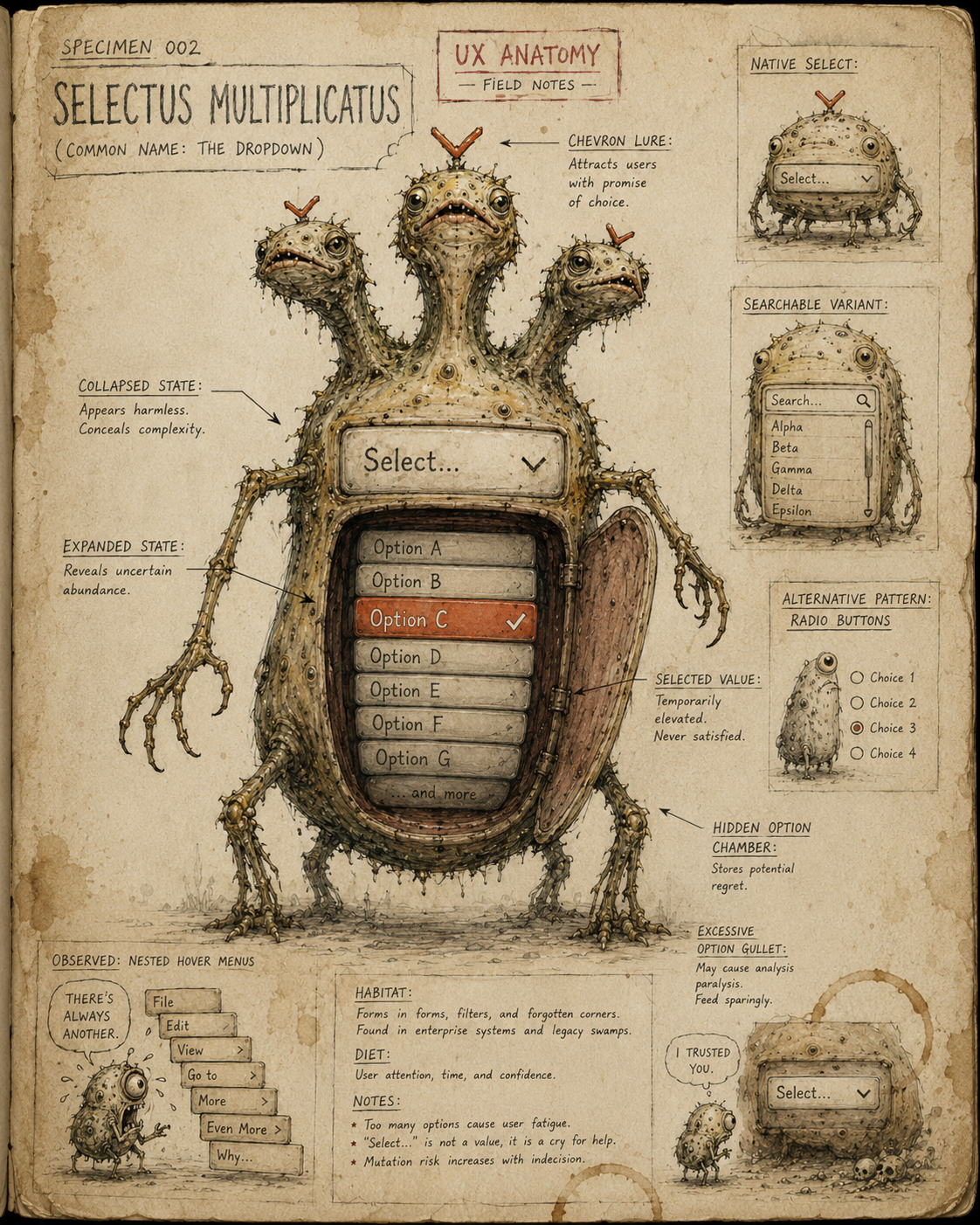
Specimen 002: The Dropdown
Creature name: Selectus Multiplicatus
Common name: The Dropdown
Habitat: Forms, filters, settings panels, checkout flows, account preferences, navigation menus, dashboards, booking systems, and anywhere too many options have been folded into a small suspicious rectangle.
Field Description
The Dropdown is a compact creature with a hidden interior.
At rest, it appears harmless: one visible choice, a small arrow, perhaps a polite border. But beneath its surface lurks a concealed list of possibilities, waiting to unfold.
This makes the Dropdown useful, but dangerous.
It is often summoned when an interface has too many options and not enough space. Sometimes this is sensible. Sometimes it is cowardice wearing a chevron.
A dropdown says:
There are more choices here, but you may not see them until you poke me.
That can be efficient. It can also be where discoverability crawls into a cupboard and quietly dies.
Anatomical Function
The Dropdown’s job is to let users choose from a defined set of options without displaying all options at once.
A good Dropdown answers:
- What kind of choice am I making?
- What is currently selected?
- What options are available?
- Can I predict what happens when I choose one?
When healthy, the Dropdown reduces visual clutter while preserving clarity.
When diseased, it hides important choices, creates awkward interaction, breaks keyboard use, causes mis-selections, or forces users to play "guess what's inside the tiny box" like a cursed administrative lucky dip.
Healthy Dropdown Traits
A healthy Dropdown usually has:
- A clear visible label
- A sensible default or placeholder
- A manageable number of options
- Options written in plain, scannable language
- Logical ordering
- A visible open and closed state
- Keyboard support
- Clear focus styling
- Sufficient touch target size
- A predictable result when an option is selected
The best Dropdowns feel like a tidy drawer.
The worst Dropdowns feel like reaching into a bin bag full of cutlery.
Common Mutations
1. The Mystery Drawer
This Dropdown gives no clue what lives inside it. It may show a vague placeholder like:
- Select
- Choose
- Option
- Please select
The user has to open it before they understand the task.
A Dropdown should not make the user perform archaeology just to discover the question.
2. The Endless Scroll Gullet
This Dropdown contains far too many options.
Country selectors, product filters, job titles, car models, and industry lists are frequent hosts.
A long Dropdown can be technically functional while still being deeply unpleasant. If users need to search, scan, scroll, and pray, the component may need autocomplete, typeahead, grouping, or a different pattern entirely.
3. The Dropdown Hydra
This is the multi-level Dropdown that grows more heads the deeper you go.
One menu opens another menu. Then another. Then another. Suddenly the user is trying to steer a cursor through a narrow hover tunnel while the whole structure collapses if they breathe too hard.
The Dropdown Hydra is especially dangerous on mobile, where hover-dependent behaviour becomes a cursed little circus.
4. The Disguised Navigation Beast
Some Dropdowns are actually navigation menus wearing form-component skin.
This is not always wrong, but it becomes risky when selecting an option immediately moves the user somewhere unexpected.
If a Dropdown changes pages, filters results, reloads content, or triggers a major action, the user needs clear feedback and control.
A Dropdown should not behave like a trapdoor unless the floor is clearly labelled.
5. The Placeholder That Lies
This Dropdown displays placeholder text that looks like a real selected value.
For example:
Select country
But visually it appears no different from:
United Kingdom
The user may think a valid option has already been chosen when it has not.
A placeholder is not a value. A ghost should not be allowed to sign the form.
6. The Tiny Tap Goblin
This Dropdown is technically visible but practically hostile.
The tap area is too small. The arrow is tiny. The list opens awkwardly. It is hard to close. On mobile, it may summon a native control, a custom control, or some unholy hybrid that nobody tested with actual thumbs.
The Tiny Tap Goblin feeds on fat-finger errors and human despair.
Behavioural Symptoms
A sick Dropdown may cause:
- Users opening and closing it repeatedly
- Users selecting the wrong option
- Users failing to notice important choices
- Users abandoning long forms
- Users missing filter options
- Rage clicks on arrows or labels
- Dead clicks on the surrounding container
- Reduced use of important settings or features
- Mobile interaction errors
- Keyboard traps or inaccessible option lists
In behaviour tools, Dropdown trouble may appear as repeated clicks, hesitation, unexpected exits, low filter usage, or confusion around form completion.
UX Diagnosis
A Dropdown is a trade-off between space and visibility.
It saves room by hiding choices.
That is both its gift and its curse.
Use it when the user does not need to compare all options at once, when the list is reasonably short, and when the available choices are predictable.
Be careful when the choice is important, unfamiliar, comparative, frequently changed, or central to the task.
The Dropdown is not a storage cupboard for design uncertainty.
If the options matter, hiding them may cost more than the space you saved.
Accessibility Notes
A healthy Dropdown should:
- Have a clear programmatic label
- Be reachable and operable by keyboard
- Have visible focus styling
- Communicate expanded and collapsed state where relevant
- Support screen reader navigation
- Preserve expected native behaviour where possible
- Avoid hover-only interaction
- Have a large enough touch target
- Use clear option text
- Avoid trapping focus inside custom menus
Native <select> elements can be boring, but boring is often reliable.
Custom Dropdowns can be beautiful, but they frequently emerge from the dev cave missing half their organs: keyboard support, screen reader state, focus management, escape behaviour, and basic dignity.
Practical Treatment
To improve a Dropdown, ask:
- Does the label explain the choice?
- Is the placeholder clearly not a selected value?
- Are the options short and scannable?
- Is the list short enough for a Dropdown?
- Would radio buttons be clearer?
- Would autocomplete or typeahead be better?
- Is the order logical?
- Are common options easy to find?
- Does selection trigger an action unexpectedly?
- Can it be used with keyboard only?
- Does it work properly on mobile?
- Does the user need to compare options side by side?
Better Patterns
Dropdowns are useful, but they are not always the answer.
Instead of a Dropdown for two or three options, consider:
Radio buttons
Instead of a very long Dropdown, consider:
Autocomplete
Typeahead search
Grouped options
Searchable list
Instead of a Dropdown for a binary setting, consider:
Checkbox
Toggle, if the change is immediate and clearly reversible
Instead of a hover-dependent navigation Dropdown, consider:
Persistent navigation
Mega menu with clear structure
Accordion-style mobile navigation
The right treatment depends on what the user needs to understand, compare, select, or control.
Field Note
The Dropdown is beloved because it makes interfaces look tidy.
But tidy is not the same as clear.
Every hidden option carries a small cost. Sometimes that cost is worth paying. Sometimes it becomes a tax on comprehension, accessibility, and confidence.
The Dropdown should be used like a drawer: helpful when organised, labelled, and easy to open.
Not like a pit.