UX Anatomy
UX Anatomy: The Tooltip
A darkly whimsical UX Anatomy field note on the tooltip: when it helps, when it hides too much, and why essential information should never live in a vanishing whisper.
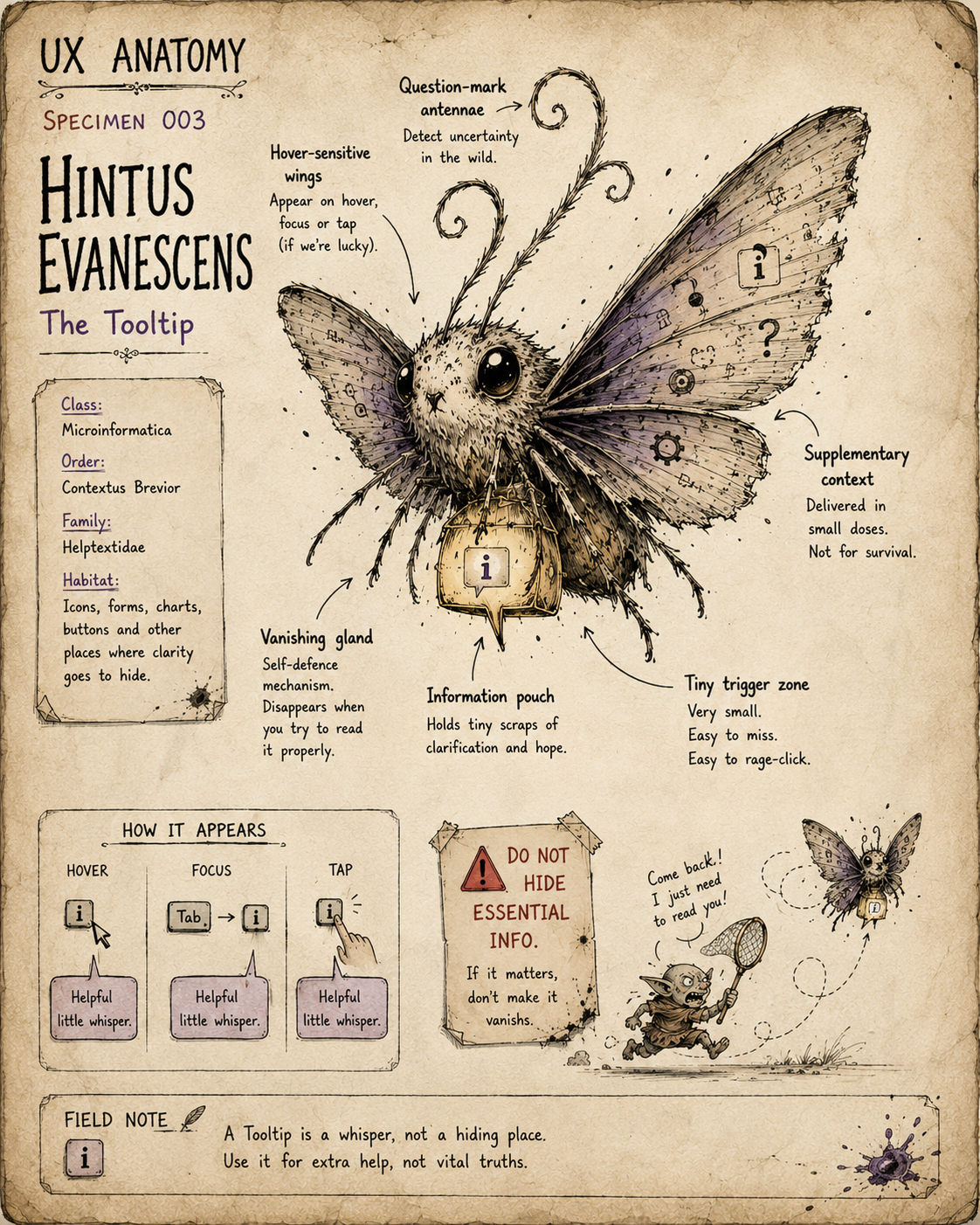
Specimen 003: The Tooltip
Creature name: Hintus Evanescens
Common name: The Tooltip
Habitat: Forms, dashboards, icon buttons, settings panels, charts, onboarding flows, dense admin tools, and anywhere an interface has tried to hide an explanation inside a tiny floating whisper.
Field Description
The Tooltip is a small, fluttering creature of the interface undergrowth.
It appears briefly, usually when summoned by hover, focus, tap, or accidental cursor grazing. For a moment it reveals a scrap of information, then vanishes back into the mist like a nervous moth made of footnotes.
When healthy, the Tooltip is helpful. It adds a little clarification without interrupting the task.
When diseased, it becomes a cowardly little knowledge goblin, clutching essential information just out of reach.
A tooltip says:
“There is something else you might need to know.”
That “might” is important.
A Tooltip should support understanding.
It should not be the only place the interface bothers to explain itself.
Anatomical Function
The Tooltip’s job is to provide brief, secondary clarification.
A good Tooltip answers:
- What does this unfamiliar thing mean?
- What will this icon or control do?
- Why might this field, setting, or metric matter?
- What extra context helps without slowing everyone down?
When healthy, the Tooltip reduces uncertainty without adding clutter.
When diseased, it hides important content, relies on hover-only behaviour, becomes impossible to trigger on mobile, or disappears while the user is still trying to read it, like a haunted Post-it note with commitment issues.
Healthy Tooltip Traits
A healthy Tooltip usually has:
- A clear trigger
- Short, useful text
- Content that is genuinely supplementary
- Predictable appearance and disappearance
- Keyboard support
- Screen reader consideration
- Sensible positioning
- Enough time for users to read it
- No vital information trapped inside it
- No interactive controls hidden inside it
The best Tooltip behaves like a helpful aside.
The worst Tooltip behaves like the only adult in the room, but keeps hiding in a cupboard.
Common Mutations
1. The Hover Wraith
This Tooltip only appears on mouse hover.
- It ignores keyboard users.
- It ignores touch users.
- It ignores anyone who does not interact with the interface exactly as the designer imagined while sipping one confident oat latte.
Hover can be useful, but hover-only help is fragile. On mobile, it may simply not exist.
If the information matters, it needs another route into daylight.
2. The Vanishing Moth
This Tooltip appears, then disappears the moment the user tries to move closer, select text, or read more carefully.
The user enters a tiny slapstick loop:
- Hover.
- Tooltip appears.
- Move slightly.
- Tooltip vanishes.
- Whisper obscenities at laptop.
The Vanishing Moth is especially common when tooltips are poorly positioned or attached to very small triggers.
3. The Essay Barnacle
This Tooltip contains far too much text.
Instead of a brief explanation, it contains a small novella, a policy document, three edge cases, a glossary, and the emotional residue of seven stakeholder meetings.
If a Tooltip needs multiple paragraphs, it may not be a tooltip. It may be help content, inline guidance, an expandable section, or a sign that the interface itself has failed to communicate clearly.
4. The Icon Alibi
This Tooltip is used to excuse an unclear icon.
The interface presents a tiny symbol and says:
“It is fine. The Tooltip will explain it.”
This is sometimes acceptable for familiar patterns. But when every key action needs a Tooltip to become understandable, the Tooltip is not helping the design. It is covering for it.
The Tooltip should clarify.
It should not be laundering bad iconography.
5. The Critical Secret Keeper
This Tooltip contains essential information the user needs before making a decision.
Examples include:
- Extra fees
- Eligibility rules
- Password requirements
- Cancellation terms
- Data usage explanations
- Irreversible consequences
- Important form guidance
This is the Tooltip at its most treacherous.
Critical information should be visible, persistent, and available before the user acts. Hiding it in a fleeting whisper is how trust goes to die in a tiny speech bubble.
6. The Obscuring Blob
This Tooltip appears directly over the thing the user is trying to read, click, compare, or complete.
Instead of helping, it blocks the field, covers the chart, hides the label, or smothers the very information it claims to explain.
The Obscuring Blob is common in dense dashboards and overexcited onboarding tours.
It whispers:
“Let me explain this by standing on it.”
Behavioural Symptoms
A sick Tooltip may cause:
- Users repeatedly hovering over the same icon
- Users missing important information
- Users abandoning forms because requirements are unclear
- Rage clicks around small help icons
- Confusion on mobile
- Keyboard users being unable to access help text
- Screen reader users missing context
- Users making avoidable errors
- Increased support queries about fields, settings, metrics, or actions
- Low confidence around unfamiliar controls
In behaviour tools, Tooltip problems may appear as repeated hover/click attempts, hesitation around fields, unexplained form errors, or users skipping features they do not understand.
UX Diagnosis
A Tooltip is a supplement, not a structural beam.
It works best when the main interface already makes sense, but a small extra note helps.
It works badly when it is used to hide complexity, avoid better labelling, explain unclear icons, or bury information that should have been visible all along.
The Tooltip is a test of content hierarchy.
Ask:
Is this information optional, or necessary?
If it is optional, a Tooltip may be appropriate.
If it is necessary, bring it into the open.
No one should have to hunt for the terms of their own confusion.
Accessibility Notes
A healthy Tooltip should:
- Be available on keyboard focus, not just mouse hover
- Be accessible to screen readers where appropriate
- Stay visible long enough to read
- Not disappear unexpectedly when users move toward it
- Not contain essential information only available through hover
- Not trap focus
- Not contain interactive controls unless implemented as a different pattern
- Use sufficient contrast
- Be positioned so it does not obscure related content
- Work across touch devices, or provide an alternative pattern
For many cases, persistent inline help text is more robust than a Tooltip.
For longer or interactive explanations, consider:
Disclosure
Accordion
Help panel
“Learn more” link
Inline guidance
The Tooltip is not the only beast in the explanatory swamp.
Practical Treatment
To improve a Tooltip, ask:
- Is the information genuinely supplementary?
- Would the user need this before acting?
- Is the trigger obvious?
- Can keyboard users access it?
- Can touch users access it?
- Can screen reader users receive equivalent context?
- Is the text short enough to read quickly?
- Does it stay visible long enough?
- Does it avoid covering important content?
- Is it compensating for a vague label or unclear icon?
- Would inline helper text be clearer?
- Would a disclosure pattern be more appropriate?
Better Patterns
Instead of hiding password requirements in a Tooltip, consider:
Persistent inline password guidance
Instead of explaining every icon with a Tooltip, consider:
Text labels
Icon plus label
Better icon choice
Progressive disclosure
Instead of putting a long explanation in a Tooltip, consider:
Expandable help section
Linked documentation
Side panel
Inline note
Instead of hover-only support on mobile, consider:
Tap-accessible help
Inline helper text
Details/summary disclosure
A Tooltip should reduce friction.
It should not make the user perform a tiny séance to summon context.
Field Note
The Tooltip is seductive because it lets an interface look cleaner than it really is.
But clean is not the same as clear.
Every hidden explanation creates a small dependency on discovery, timing, device, input method, and luck.
Use the Tooltip for whispers.
Do not use it for warnings, rules, consequences, or anything the user would reasonably shout about later.